This week for our VR environment, I wanted to work on adding some VFX atmosphere elements.
Before adding particles, I wanted to refine further the nav mesh system. While our map would allow for teleportation freely in some areas, there were still some inconsistencies, once the user hit our doorway from the vestibule. After looking into the navmesh, I found that the mesh pathing was being interrupted by some collision hitbox.
Ideally the navMesh (green path) would be connected as a single shape. Here we can see this path has been broken apart into a few pieces. After clicking around to surrounding objects, I located the wall that had a bounding box crossing that section of the navMesh. I then went into the navMesh and changed it's collision hitbox to match the exact geometry of the objects.
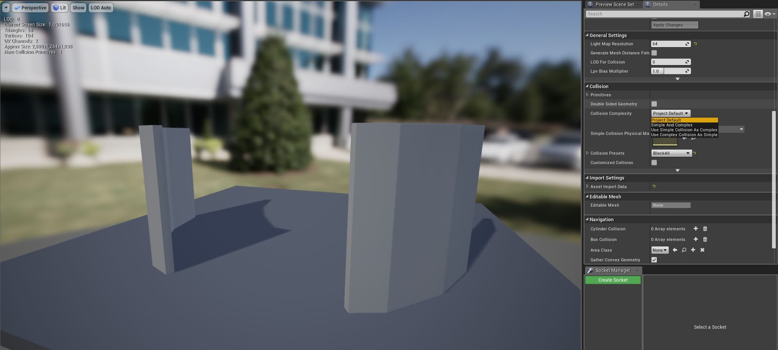
Going through the map, changing collision hitboxes to match the geometry of the assets themselves, I reduced the influence of environmental geometry on the nav mesh and allowed users to freely teleport throughout the map without glitching into a step-style movement system where the user can only teleport a few inches in front of them.
With the nav mesh more reliable, I wanted to add some atmospheric particle effects. I started by dispersing transparent dust particles throughout the map. I also added a light atmospheric height fog, to imply a bit of distance, and fits our aesthetic as our greenhouse is towards the top of a tower.
One more element I wanted to add was a "Godray" of sunlight coming from our directional light source. Using a transparent mesh with animated texture, this ray will help highlight our hog body in the scene as the source of interest.
Showing posts with label 2D Art. Show all posts
Thursday, November 15, 2018
Thursday, November 8, 2018
Story Design - Tech Art Solutions to our VR Environment
This week we split tasks up between 2D art, 3D art, and VR implementation.
I focused specifically on the issues we were encountering with the lighting and navigational mesh problems in our VR space, and how to correct them for a second pass.
In our first week, we would try baking our lighting information into the scene and see our shadows rendering in a very abstract/distorted fashion.
As you can see the tree shadows on the back wall are losing the geometry of the shapes casting them.
After looking through the different factors contributing to our current light setup I changed a few things to correct this distortion.
One of the largest factors contributing to this was the shadow map resolutions of our proxy structure walls. Being a temporary setup, walls were established by stretching default cubes to a desired size. This meant that the normal resolution for shadow information remained static, as the size of the geometry would be expanded 2-3 times larger. I needed to increase the shadow map resolution for the geometry that would be catching our shadow information to regain the proper shapes of the objects blocking the light.
The results were noticeable.
We can see this a little more clearly indoors:
You can see the difference when we look in to the light properties of this wall that catches the statue's shadows at a lower resolution like 256
After overriding the light map resolution and cranking it up to match the general scale of the wall, we can see the shadows being rendered at a shape that much more accurately matches that of the object casting the shadow.
After the light map resolution changes, I set out to make a secondary precaution to lighting problems that occur whenever you shine a light through a translucent object. (Specifically our glass dome)
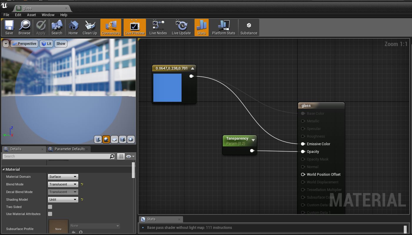
Going into the glass material for our dome, I changed the shading model parameter to "unlit" essentially canceling a conflict between lighting interactions with our glass dome and our directional light when trying to reach the internal geometry. Our dome no longer has lighting information coming from it to conflict with the play space inside of it.
One final problem that we encountered last week was with our Nav Mesh that forced a really broken VR teleport system. After investigating the problems with Alexis Damron, we found that we had 2 navigational meshes colliding between our indoor and outdoor environments.
We deleted the secondary Nav Mesh and expanded the original to cover the entire playvspace to simplify the movement system for our second week proxy showcase.
My plans next week will focus on lighting our 2nd revision environment, once our 3D team has imported it, and creating the toon-shading system for our spiritual characters.
I focused specifically on the issues we were encountering with the lighting and navigational mesh problems in our VR space, and how to correct them for a second pass.
In our first week, we would try baking our lighting information into the scene and see our shadows rendering in a very abstract/distorted fashion.
As you can see the tree shadows on the back wall are losing the geometry of the shapes casting them.
After looking through the different factors contributing to our current light setup I changed a few things to correct this distortion.
One of the largest factors contributing to this was the shadow map resolutions of our proxy structure walls. Being a temporary setup, walls were established by stretching default cubes to a desired size. This meant that the normal resolution for shadow information remained static, as the size of the geometry would be expanded 2-3 times larger. I needed to increase the shadow map resolution for the geometry that would be catching our shadow information to regain the proper shapes of the objects blocking the light.
The results were noticeable.
We can see this a little more clearly indoors:
You can see the difference when we look in to the light properties of this wall that catches the statue's shadows at a lower resolution like 256
After overriding the light map resolution and cranking it up to match the general scale of the wall, we can see the shadows being rendered at a shape that much more accurately matches that of the object casting the shadow.
After the light map resolution changes, I set out to make a secondary precaution to lighting problems that occur whenever you shine a light through a translucent object. (Specifically our glass dome)
Going into the glass material for our dome, I changed the shading model parameter to "unlit" essentially canceling a conflict between lighting interactions with our glass dome and our directional light when trying to reach the internal geometry. Our dome no longer has lighting information coming from it to conflict with the play space inside of it.
One final problem that we encountered last week was with our Nav Mesh that forced a really broken VR teleport system. After investigating the problems with Alexis Damron, we found that we had 2 navigational meshes colliding between our indoor and outdoor environments.
We deleted the secondary Nav Mesh and expanded the original to cover the entire playvspace to simplify the movement system for our second week proxy showcase.
My plans next week will focus on lighting our 2nd revision environment, once our 3D team has imported it, and creating the toon-shading system for our spiritual characters.
Thursday, November 1, 2018
Story Design - Lighting Style Guide
For this week, while character and environmental leads work on 2nd revision passes, I focused my attention on how lighting and materials will work in "Tales of Thomas Carnacki and Fantomah"
1st Pass Lighting Test on VR environment
Lighting/Shading Style Board – Tales of Thomas Carnacki and
Fantomah
Main stylistic division is the shading between
characters/environment of the natural world, and those of the supernatural.
Shadows that fall on the protagonists should be similar to those found in the
environmental world around them. (Diffuse, rounded, roughness reflecting the
material it lands on) Shadows that fall on the supernatural
characters/environments should have harder, toon shaded or cell shaded lines
that divide light values, or ignore environmental lighting completely.
Natural World Lighting:
-Diffuse with no linework
-Gradual fade between
value
-Material determines fade-rate
-Colors are complex and mixed
Supernatural World Lighting (Option 1):
-Toon/Cell shading with linework
-2D plane
- hard cuts between values
- material possibly determines fade rate
- characters can ignore light completely
-colors are generalized/simple
-2 tone gradients replace complex values
Cool World
Flat 2D figure in a 3D space, with little to no response to lighting
Gorillaz
Slight reaction to light direction, gradients shift 2-tone color values
Supernatural World
Lighting (Option 2):
-Toon/Cell shading with linework
-3D model with cell shade
- hard cuts between values
- material possibly determines fade rate
- characters can ignore light completely
-colors are generalized/simple
-shading nodes breakup value/color differences
1st Pass Lighting Test on VR environment
Thursday, October 25, 2018
Story Design - Character Thumbnails
Designing alternate thumbnail concepts of main characters
Concept work of main antagonist: The Hog King
Thursday, October 18, 2018
Character & Environment Final Pass - Red Riding Hood
Second week of our character and environment. Refining the environment and character shading for the final pass. I went for a more comic-style scheme.
Thursday, October 11, 2018
2D Character & Environment 1st Pass
I am planning to take the little red riding hood story to a whole new level by bringing our innocent protagonist and dropping her into a modern zombie apocalypse. For this week I wanted to focus on really nailing down the line-work and composition of the image. Using next week to finalize environmental elements and work on color/shading.
The scene of my environment is set in Washington Street, Manhattan.
The perspective lining and skyline silhouette of this street inspired me to revamp it for a zombie apocalypse in my environment.
I then went to work adding the first pass of my character
There is still much work to do in terms of styling the environment to a more post apocalyptic scenario, and flushing out my painterly look, but a large majority of the constructive work had been completed.
The scene of my environment is set in Washington Street, Manhattan.
The perspective lining and skyline silhouette of this street inspired me to revamp it for a zombie apocalypse in my environment.
I then went to work adding the first pass of my character
There is still much work to do in terms of styling the environment to a more post apocalyptic scenario, and flushing out my painterly look, but a large majority of the constructive work had been completed.
Friday, October 5, 2018
2D Character & Environment Project
Initial Concept :
Story - Little Red Riding Hood
World - Modern Zombie Apocalypse
"The road to grandma's house has never been so dangerous..."
Game Style Inspiration: RWBY
Thursday, October 4, 2018
2D 3-Point Lighting
Taking a crack at 3 point lighting this week.
Posed reference object
Trying a new painterly style wherein I take the base line art of the image, then overlay it with my original so I can pick and block out layered color combinations found throughout the image, and use the smudge tool to blend and add a bit of stabilization to the image.
Posed reference object
Trying a new painterly style wherein I take the base line art of the image, then overlay it with my original so I can pick and block out layered color combinations found throughout the image, and use the smudge tool to blend and add a bit of stabilization to the image.
Thursday, September 27, 2018
2D Week 5 Perspective - John Berkey
This week we are working on the use of 1, 2, and 3 point perspective in 2D art. For our reference artist, we look to the work of John Berkey and his futuristic renditions.
For my piece, I wanted to recreate this work from the Chronicles of the Lensman, book cover.
While this image has a slight fish-eye lens style skew to it, I was able to identify a rough 3 point perspective that constructs the overall shape.
To assist with recreating this work we used 3D modeling tools in maya to roughly construct the image in a digital space.
With the 3D model rendered out, I could use my original image, and my 3D model to sketch out the shape of my image.
All that's left to do is to add some values to the ship and background to get my final image.
For my piece, I wanted to recreate this work from the Chronicles of the Lensman, book cover.
To assist with recreating this work we used 3D modeling tools in maya to roughly construct the image in a digital space.
With the 3D model rendered out, I could use my original image, and my 3D model to sketch out the shape of my image.
All that's left to do is to add some values to the ship and background to get my final image.
Thursday, September 20, 2018
2D Compositions - Drew Struzan
This week we are focusing on the art of visual compositions. The structure of an image that allows a natural direction for the viewer eye to a target area, or make them feel like they are actually in your image. Drew Struzan utilized composition like a science during his career making movie posters. For this assignment, I will be taking one of his posters and recreating the image, ensuring the key elements of composition are carried over in the end product.
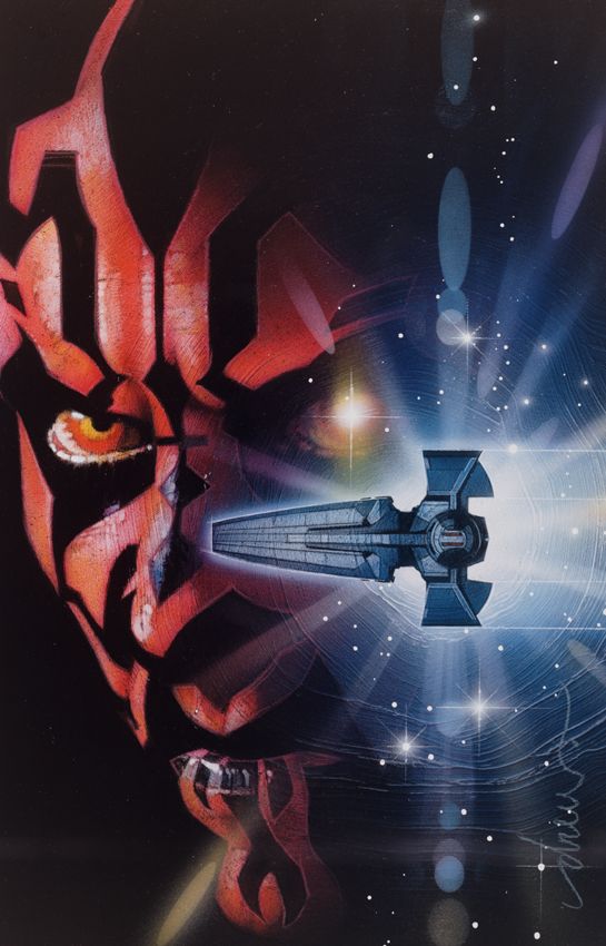
For this assignment I will be using his poster "Star Wars Darth Maul #2" that was used as the final key cover art for the marvel paperback comic.
In this image, I can identify at least 3 different compositional structures that are used by Drew to direct the viewers eye:
Radial
Cross
Circular
Using these structures, Drew can direct how a viewer's gaze tracks across his work, and with that, ensure the elements of his work that he deems most important are viewed first.
To start, I began with the basic background and Darth Mauls Facial patterns.
With my base down, I added some of the compositional elements down; with the ship and reflective light adding the cross/radial scenes to the work.
I then went in and cleaned up the two subjects of my image and added some comic-style shading to add an element of depth.
To add the final circular composition, and polish up the rest of the image, I added additional back lighting, bloom, and circular strobe patterns to the ship.
For this assignment I will be using his poster "Star Wars Darth Maul #2" that was used as the final key cover art for the marvel paperback comic.
In this image, I can identify at least 3 different compositional structures that are used by Drew to direct the viewers eye:
Radial
Cross
Circular
Using these structures, Drew can direct how a viewer's gaze tracks across his work, and with that, ensure the elements of his work that he deems most important are viewed first.
To start, I began with the basic background and Darth Mauls Facial patterns.
With my base down, I added some of the compositional elements down; with the ship and reflective light adding the cross/radial scenes to the work.
I then went in and cleaned up the two subjects of my image and added some comic-style shading to add an element of depth.
To add the final circular composition, and polish up the rest of the image, I added additional back lighting, bloom, and circular strobe patterns to the ship.
Thursday, September 6, 2018
Brian Froud - Shapes and Silhouettes
This week we will be taking a character from the creations of Brian Froud and altering it's silhouette to demonstrate both the importance of a character's shape language, and practice a typical process found in the early concept stage of game design.
For my project I chose this character.
I took creative liberties to test fantasy, sci-fi, and comedic, even humanistic silhouettes with this design. My goal was to not to maintain a general theme consistency, but rather take core shape elements of this character's design, and see how I could push it into new or unexpected forms.
Subscribe to:
Posts (Atom)